Demystifying Expiry Dates on Charts: A Guide for the Visually Inclined
Have you ever stared at a chart teeming with data, only to be stumped by cryptic symbols or overshadowed by irrelevant information? When it comes to expiry dates, clear visualization is crucial. After all, a single glance should tell you if that carton of milk is fridge-worthy or farewell-worthy. This guide dives into the world of illustrating expiry dates on charts, making you a pro at deciphering timelines and keeping your data fresh.

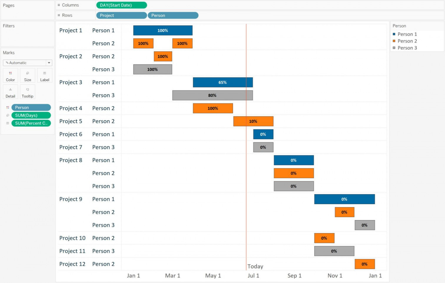
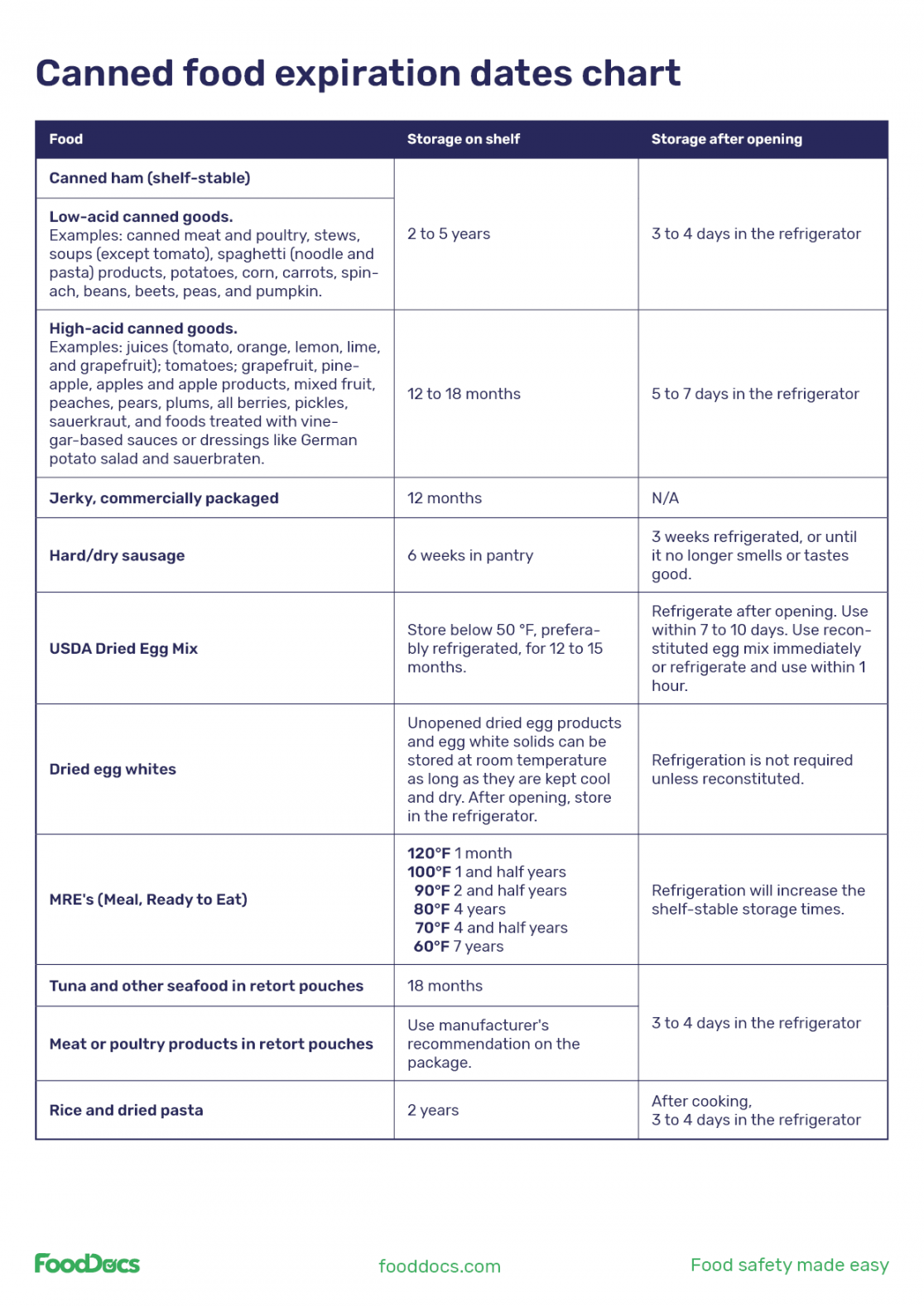
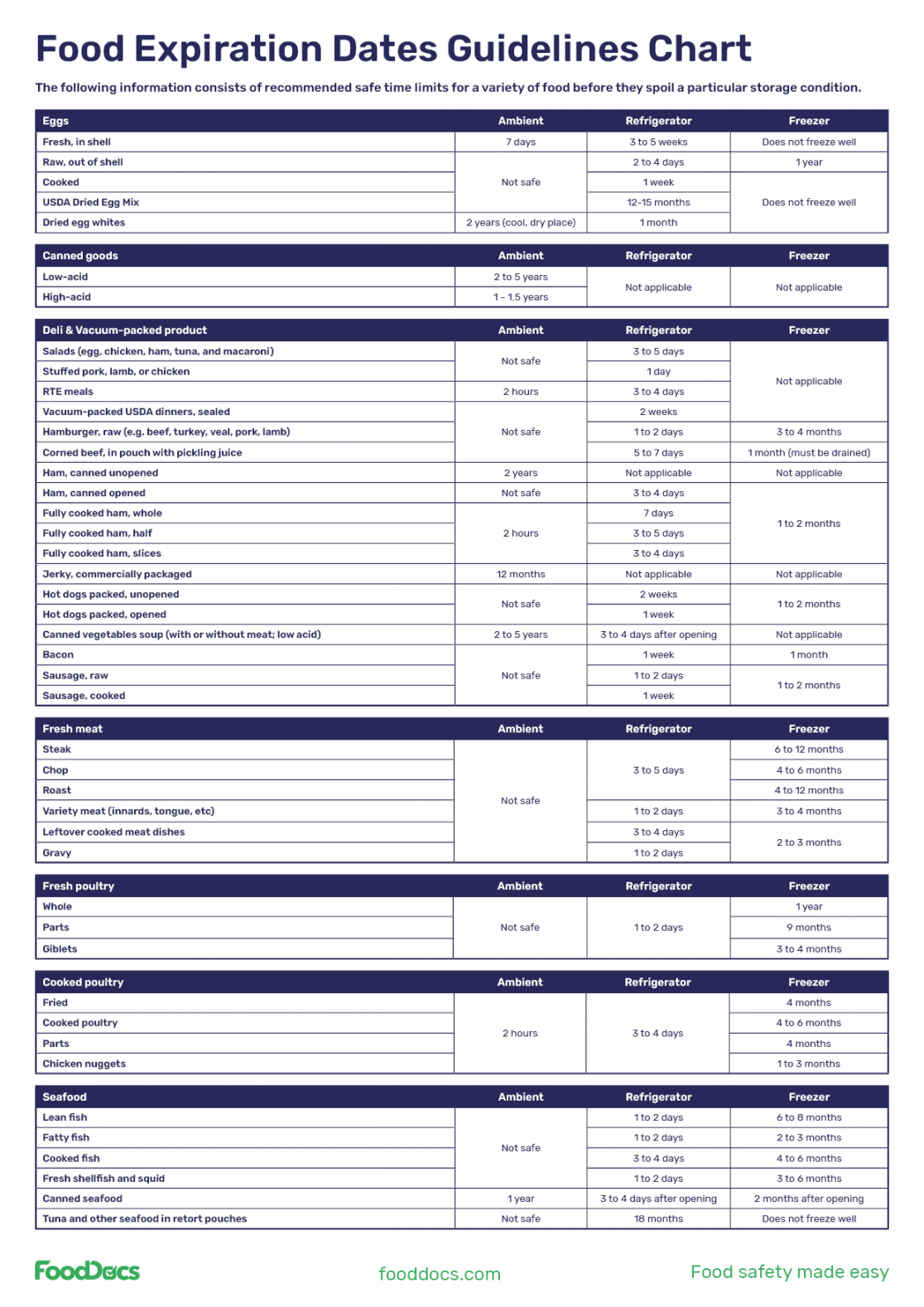
Imagine a chart tracking the shelf life of various products. Each product has its own expiry date, and we want to portray this information visually. This could involve:

Highlighting expiry dates: Dates themselves could be emphasized with bold text, different colors, or even icons like clocks or calendars.

Expiry dates are more than just numbers; they’re flags waving in the data windstorm. Clear visualization helps us:
Spot impending issues: Quickly identify items nearing expiry, allowing for timely action to avoid waste or stockouts.

Traditional methods like text annotations or simple date markers often fall short. They can be visually cluttered, lack intuitiveness, and fail to convey urgency effectively.
Let’s unleash the power of visual storytelling! Here are some innovative ways to illustrate expiry dates:
Countdown bars: Bars shrink as expiry dates approach, creating a dynamic visual cue.
While creativity is key, remember – clarity is king. Strike a balance between informative and visually appealing. Use consistent color schemes, legible fonts, and clear legends to avoid overwhelming your audience.
By embracing creative visualization techniques, you can transform expiry dates from cryptic codes into captivating storytelling elements. This not only enhances data comprehension but also empowers informed decision-making. So, the next time you encounter a chart brimming with perishable data, remember – a little visual magic can go a long way in keeping your information fresh and your audience informed.
1. What if my data has multiple expiry dates for different items?
– Utilize layered charts or separate charts for each category to maintain clarity.
2. Can I use expiry dates on non-physical items like tasks or licenses?
– Absolutely! Adapt the visualization techniques to fit your specific data type.
3. What tools can I use to create these visualizations?
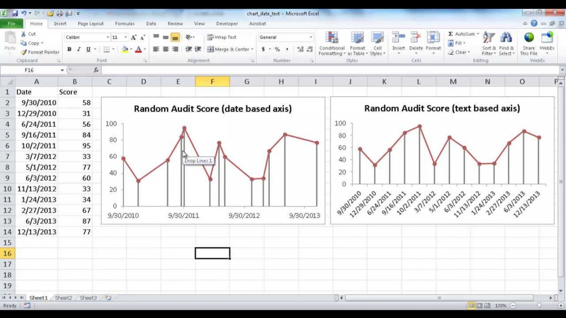
– Popular spreadsheet software like Excel and Google Sheets offer basic charting options. For advanced creations, explore dedicated data visualization tools like Tableau or Power BI.
4. How can I ensure my visualizations are accessible for everyone?
– Opt for high-contrast color palettes, avoid relying solely on color cues, and provide alternative text descriptions for visual elements.
5. Where can I find inspiration for creative expiry date visualizations?
– Online data visualization galleries and design communities offer a treasure trove of ideas!
Remember, the key to effective expiry date visualization lies in understanding your data, choosing the right tools, and prioritizing clarity above all else. So, go forth and conquer the world of charts, one expiry date at a time!